Garage Project Photo-Chop-Shop

Every year at Golding’s we’ve run an event with Garage Project as an SPCA fundraiser. A sort of tap takeover/bring your dog to the pub day. This year was a raging success and collectively we raised over $6000 for the Wellington SPCA. Absolutely Stirling.

One of the things we decided to do was rename every beer on tap with dog/animal puns. Sounds easy enough. We’ll just change the name on the menu board, and that’s sorted. Oh, and I got asked very nicely, if I could please change the tap badges to make them more ‘doggy’.

Well now, messing around in Photoshop is one of my favourite ways to waste time when I should be doing more important things at work. We had eight beers to re-brand, plus one new beer that required all new art. Whilst some came out better than others, overall I’m pretty pleased with the end results (if I do say so myself). I thought I’d share them here.

Credit to Mattie, Ian and the Garage Team for the dog puns.

Death From Above

At Golding’s we use a rectangular tap badge, quite unlike what most other bars use. So my usual technique is to take bottle labels or posters, then crop and shrink them down to size. With Garage project I’m usually pretty blessed. They frequently commision artists to create unique label art. In this case, it’s Tim Gibson of Flying Whities who made the original:

DFA

And our version…

HE WILL KILL YOU WITH CUTENESS!

HE WILL KILL YOU WITH CUTENESS!

Baltic Porter

The original is designed by ALC, and features a boxing Russian Bear.

GP Baltic Porter

For out version, I nicked a wolf head from another piece of ALC art and popped it on the bear’s body (because wolves are dogs, right?).


11222037_653796748055352_2676029605504154116_o

Mon P’tit Chou

Mon P’tit Chou means “my little cabbage”.

MonP_titChou_Poster_417x591_150dpi_1024x1024

The original art reminds me very much of the work of a wonderful artist Stasia Burrington. So I cycled through her portfolio to find something doggy that still had the right feeling basically stole it wholesale (sorry, it was for charity).

MON PETIT CHIEN

Mon P’tit Chien means ‘my little dog’. This badge presented an interesting challenge – typefaces. Swapping the image was easy, but altering a unique lettering, that’s difficult. For expediency, I started from scratch, and went with a typeface that evoked the right feeling for me.

China White Beyond the Pale

Beyond the Pale - A2 Poster

Silhouette of a bottle? No problem. How about Silhouette of a cat? I had cats growing up, so I couldn’t resist a kitty reference somewhere in here.

BEYOND THE TAILRecreating the background was the hardest part of this one. In fact, I feel like this is perhaps the most slap-dash of all the badges I made. Then again, I was on a deadline and I feel I got the jist of it.

Hapi Daze

6f5740b0b53838786116172a51510575

This is another Tim Gibson work. It’s pretty great. All I had to do was change the words and drop in a doggie with a frisby.

YAPPY DAZEWhilst doing this one, I noticed for the first time that the chap in the lawn-chair is blazing a splif…

For him, life is sweet.

For him, life is sweet.

Hops on Pointe

This one I’ll admit to copping out on. The art simply does not crop well.

HOP_TBforShopify_500x500_150dpi_49a72ba7-f9ac-4100-9bfc-53ca1d93b680_1024x1024

So basically I simplified the whole design, added an ‘R’ and popped in a few paw-prints.

HOPS ON POINTER

L’il Red Rye

This was my easiest job of the lot, being the most canine-related of all the GP bottle art I was working with.

LilRedRye_TBforShopify_500x500_150dpi_1024x1024 (1)Again, text presented the biggest challenge. I don’t love the text I went with, but it was the best I could wrangle. As for the doggies, a little palette swap to make them more Retriever-y and…

L'IL RED RETRIEVER

Angry Peaches

This is both one of my favourite Garage Project beers, and the badge I’m proudest of/spent the most time on.

AngryPeaches_Poster_417x591_150dpi_1024x1024

It’s also, coincidently, the badge that had the most Photoshop-trickery/bullshit go into it. Can you spot any?

ANGRY POOCHES copy

My only wish is that I’d made the top dog blue. Otherwise, FUCKING NAILED IT!

Tummy Tickles Brown Ale

So we had one more beer to make a completely new piece of art for. Tummy Tickles was a one-off small-kit brew batch of a hoppy Brown Ale. So basically, one of my favourite styles of beer, ever.

I had a concept, which was fake/subversive Victoria encyclopedia illustrations. I think that there’s potential for an entire brewery brand to be based around this idea (Remedy Brewing has played with something similar).

Here was what I came up with:

TUMMY TICKLES FINAL

I think I can safely say I nailed the look I was going for.

How to Name a Brewery

With so many new breweries opening in recently and no doubt more opening in months to come, there’s a discussion we need to have: how to name breweries and beers. This post is going to be related to the former rather than the latter (I’ll write that next). Both I think, are very important, because of one simple truth:

A good name attracts customers and sells more beer. A bad name discourages customers and will lose you sales. 

This is a simple fact that I’ve observed from almost six years of selling beer to the public. There are also quite a few pitfalls that new breweries can fall into when it comes to naming themselves and their beers.

Now I know what you’re thinking and I totally agree: surely the quality of what’s in the glass should be more important than what it says on the label. Yes, it should. But getting your beer into the hands of first-time customers is also important. You want your brewery name to stick in someone’s head and, if your beer impresses them, you can create something valuable – a returning customer.

It’s true lot of brewery names come from stories. Stories are good. Stories help build a brand. ParrotDog was founded by guys who owned a parrot and called each other ‘Dog’. That’s great. But stories are not what I want to talk about here. I’m more interested in the mechanics of what makes one brewery name work better than another.

I had originally intended for this post to list some hard and fast rules of how to name breweries The more I thought about it, the more I realised how much of this is subjective. But in my six years I’ve poured more beers than most people will drink in a lifetime. There are certain things about brewery names that I see trip-up customers time and time again. Here are a few, what I guess you’d call ‘guidelines’ to avoiding some of the major pitfalls of naming a brewery.

No offence to any brewers I use as examples. Firstly this is no reflection on the quality of your beer. Secondly, quality of beer is ultimately more important. A bad brewery name is no reason to turn your nose up at a good beer. Third, if you’ve had your name for years and you’re doing just fine, then by all means ignore this post. This is more directed at the newcomers. Alright, let’s do this. And we’ll start with perhaps the most important point first.

1. Keep it Short

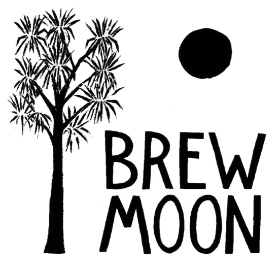
Short is good. Short is dynamic. Short is easier to remember. Brewery names need to be direct and to the point. It should be one or two words, three at most (but only if one of them is ‘and’ or ‘the’). This doesn’t include the words ‘Brewery’, ‘Brewing Company’ or similar, which naturally get sliced off the end in conversation. Nobody ever refers to Brew Moon by its full name: ‘Brew Moon Brewing Company’. Brew-Moon What I consider to be good brewery names are a handful of syllables that roll off the tongue and are away: ‘Liberty’, ‘8 Wired’, ‘Three Boys’. These are simple words that you can say without tripping-up over. There’s a very good reason for this – when written on beer labels, tap badges or menu boards or spoken to bartenders, brewery names sit in front of a beer name. Let’s take an example: 8 Wired Hopwired IPA – Good. Quick, easy, to the point (some people don’t like the repetition of ‘wired’ in the name, but that’s a different discussion).

All G.

Everything as it should be.

Sometimes however, customers get confused about this name and refer to 8 Wired as ‘Number 8 Wired’ or occasionally ‘The Number 8 Wired’. Fair enough, it’s an easy mistake to make as the name originates from number 8 wire. But for argument’s sake, let’s give that a go. The Number 8 Wired Hopwired IPA – Bad. A clunky mouthful.

This is why we can't have nice things.

This is why we can’t have nice things.

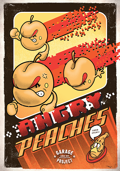
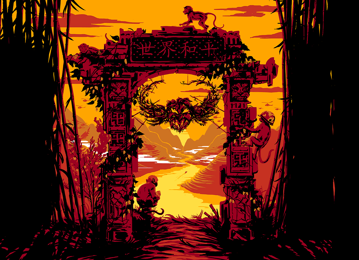
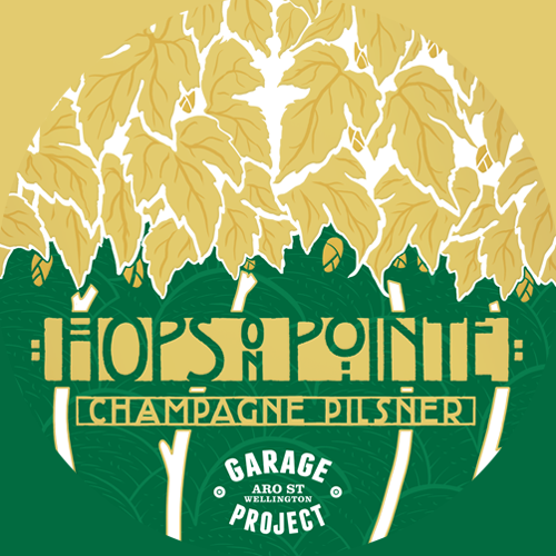
Beer names can already lumbering enough, if you’re going to hitch it to an already difficult brewery name, you’re not doing yourself or your customers any favours. But how long is too long? Hard to say. Two breweries that I think are pushing acceptable limits of syllables are ‘Garage Project’ and ‘Beer Baroness’. I think both get away with it, Garage Project because it has a nice structure, and Beer Baroness because it has alliteration, but that’s just me.

2. Names of People/Places are Perfectly Acceptable

There are quite a few breweries named after the brewer. Sometimes it’s a first name, like Mike’s or Dale’s. More frequently, It’s a surname:  Townshend, Gailbraith’s, Croucher, Harrington’s, Emerson’s, Fitzpatrick’s, Cassels and so on. Very rarely, it’s both first and surname – I’m looking at you, Ben Middlemiss.

Perfectly fine. Except maybe the 'Crisp'...

Perfectly fine. Except maybe the ‘Crisp’…

Likewise, place names are commonly used: Invercargill, Baylands, Coromandel, Hot Water, Kaimai, Queenstown, Arrow, Waiheke, etc. This is also a good option, although I guess it might reduce your options of changing where your brewery is (Baylands is not on Baylands Road anymore). Personal or place names are perhaps the least interesting way to name a brewery, but they are basically functional. I think names like these are a good option because they usually obey rule 1. – They’re short and informative. Although, as I type this I realise I shall never found a ‘Jauslin’s Brewing Co.’ as no Anglophone can ever say it properly…

3. No More Dog Breweries

Animal names are another popular choice, and seem to work fairly well. They also tend to be short and to the point. Some go simple – just the animal name. Tuatara, Moa and Kereru fit this bill. Others, like to use what I call the ‘Indie Band’ approach. A trend in recent years amongst indie bands is to use a something-animal’ name. Hence: Modest Mouse, Fleet Foxes, Frightened Rabbit, Wolf Parade, Tame Impala, Arctic Monkeys, Band of Horses, Grizzly Bear, Deerhunter, and so on (it’s a regular Animal Collective).  Similarly, in the brewing world, we have Golden Eagle, Golden Bear, Monkey Wizard, Velvet Worm, Pink Elephant, Crafty Trout, and I could go on. Animal names are a good option, with one notable exception: Dogs. You see the problem is, people come in and say “I want that ‘Dog Beer’ please,” and I really can’t help them because in New Zealand, we have:

That may not seem like many but they may, even in the New Zealand context reasonably also be referring to:

  • BrewDog (Scotland)
  • Moon Dog (Australia)
  • Flying Dog (USA)
  • Dogfish Head (USA)

I’m officially marking New Zealand as above quota on ‘dog’ breweries. No more guys, we’ve got too many already. In fact a search for ‘Dog’ on Untappd brings up 760 brewery results. Forget New Zealand, the whole world has too many dog breweries.

4. Jokes Get Old

So you’ve come up with a clever pun or something, and you think you’re going use it to name your brewery. That’s cool, but keep in mind one thing: you will be repeating that joke again, and again, and again. It gets less funny every time (this is known as The Bee Sharps Effect). Now this isn’t an issue if the name works well regardless of the joke. I’m thinking of Yeastie Boys here. “Yeastie Boys! Haha, it’s a music-themed brewery riffing on The Beastie Boys!” But underneath that joke, I find ‘Yeastie Boys’ to be a nice, short, chewy-sounding name. YB But what if the name isn’t so good? Well then the joke just sits there being repeated, again and again. And it’ll be repeated a lot. It’ll be tacked on the front of every beer you brew. It’ll be plastered on menu boards and tap badges. You will never escape it. Fork & Brewer, I’m looking at you guys. The Cameron Slater school of humour. Yeah. Nah. Sorry Sean, Colin, Neil and Kelly. I really like your beer, but I think you should have stuck with Bond Street Brewery.

5. Choose Descriptors Carefully

A lot of brewery names have descriptive words in them – Pink Elephant, Wild & Woolly, Fat Monk and so on. These are all fine. But choose your words carefully, because if you include a descriptor in your brewery name that frequently applies to beer, many customers will automatically assume that descriptor applies to any beer you make. What do I mean by that? Well, let’s look at the two most common examples. First of all, ‘hop’. As in: Twisted Hop, Dr. Hops, Hopmonger, Hophugger, Hop Federation, Hop Baron, Hops Valley, etc. Besides being incredibly unoriginal at this stage, having ‘hop’ in your name can put off many inexperienced customers who see the word on a menu and automatically steer clear of it, because for whatever reason, they’ve decided they don’t like hoppy beer.

It might also be a time to call a moratorium on 'Hop' names as well...

It might also be a time to call a moratorium on ‘hop’ names as well…  Although three of these breweries are no longer operating.

Likewise, but perhaps for another reason, be wary of the word ‘golden’. As in Golden Eagle, Golden Bear and Golden Ticket. Inexperienced drinkers see the ‘golden’ on a menu and automatically assume the beer in question is a lager of some sort (the same but opposite may apply to the ‘black’ in Black Dog).

Think I’m kidding? I’ve had customers come up to the bar and ask me: “So this Golden Bear Seismic IPA, that’s like a Pilsner, right?” or “Golden Eagle Coalface Stout, that’s a lager, yeah?” Or they just order a Coalface (which is an awesome beer by the way) and look at me blankly when I put a pint of black beer in front of them.

Now I know ‘Coal’ signifies dark and ‘Stout’ should clinch the deal, but what needs to be understood here is that a large slice of customers, perhaps even a majority of the people who drink all the ‘craft’ beer in New Zealand, are not Beer Geeks. They may not know the difference between a Lager and a Stout. They may assume all Lagers are pale, and all ales are hoppy. They may have all manner of assumptions they have picked up or been taught over the years.

I’m not saying we need to pander to or talk down to this demographic (that’s patronising behaviour that breeds resentment). I’m just urging a bit of forethought as to as to how your brewery name will influence customer expectations.

6. No. More. Fucking. Dog. Breweries.

If you’re opening a brewery and you, even for one moment, consider giving it a ‘dog’ name, I will come around to your brewery, open all the valves on your tanks, and then beat you to death with your mash paddle. I don’t want to go to prison.

Please don’t make me.

My Secret Alter-Ego

Eagle eyed readers may have noticed a slight change in the blolg’s appearance a while back. Instead of luscious, yet slightly generic shots of beer bottles and taps, my site now has a quicky graphic of a megaphone, constructed from the silhouette of a bottleneck. It’s been christened ‘The Megafoam’ (by Phil) and damn, now I wish I’d thought of that for the blog’s name…

Anywho, I’m sure you’re all wondering how I could afford to hire a professional designer for what is essentially a hobby-blog. The answer is: I didn’t; I designed it myself. Ok, so it doesn’t look that professional. Humour me. I got bored whilst having a staffie, and started playing with some graphic design software on my work laptop. It came out ok, but I have plans to tinker with it in the future.

But to get back on topic, I do have a second secret career that few know about: graphic designing tap badges for the beers on tap at Golding’s.

Alright I’m being slightly obtuse here. What I mean is, I print out all the tap badges that go in the light boxes in Golding’s tap-banks. I could legitimately call this a second career though, because I probably do more actual design work that is actually used and seen by customers than most graphic design Interns in major companies could ever dream of.

You see we have rectangular tap badges at Golding’s and frequently small New Zealand breweries don’t have artwork that fits these. Garage Project are the notable exception to this. Which is why their tap badges frequently look rather sexy:

Noice.

Click to enlarge.

In other cases, some they have circular tap badges which look a little small and silly in the light box. High res versions of these can be scaled up sometimes to a good result. Frequently you can also get away with using a digitised bottle label. Sometime the brewery has no artwork In rare cases, the brewery’s branding is so hideous that Sean won’t allow it in the bar.

Whatever the reason, I frequently have to knock up tap badges for a range of beers and breweries. So I thought I’d share a few of my favourites.

The ParrotDog Pixel Series

This badge series began with searching ‘Dead Canary’ and amongst the more morbid images was a pixel-art canary, which I fell in love with. And boom, a series was born!

PDog Taps

Since I started these, ParrotDog has begun creating more poster art for their beers, which is great. It means I will probably phase this series out eventually. They remain however, some of my favourites, because these particular badges take a basic idea and adapt it to suit the beers across the entire brewery. Sometimes though, you have a concept that suits a specific beer, which leads to great one-off badges. It just so happens that two of my favourite creations are from the same brewery…

Funk Estate Oh Kamiyo & So’Fisticuffs

Funk Badges

Click make big.

The concept behind the Oh Kamiyo badge was to capture the feel of a bootlegged VHS box, complete with mistranslation in the Japanese characters (that was *totally* intentional…). Going to say I nailed that one. The So’Fisticuffs on the other hand, I was aiming for a vintage boxing poster. Whilst I captured the feel adequately, I would have liked to included more bombastic flavour text, but the limit of the medium frequently means simpler is better.

None of these though are my favourite tap badge I’ve ever created. Oh no. That honour goes to this little fellow. My masterpiece…

Yeastie Boys/Panhead/Firestone Walker Engelbert Pumpernickel

IMG_20140714_180828

Click size huge.

Here we see (the wrong) Engelbert Humperdinck with a loaf of pumpernickel for a head. I love this tap badge. From a design point of view, it’s not perfect by any means, but god-damn, it captures something about the beer and the people who made it. It was also immensely fun to Shop bread over the face of a historical figure…

I all seriousness, making tap badges is one of my favourite aspects of my job, but it really shouldn’t be. New Zealand’s Small breweries really need to brush up on brand promotion customer service (because that’s what this falls under ultimately) from a brand point of view.

It so happens, that I have the skills and technology to play with basic graphic design, but a lot of other bar managers don’t. As a result you frequently see poorly made, often handwritten (and sometimes barely legible) tap badges. This really doesn’t do anyone any favours; bars, breweries and certainly not customers.

This topic deserves a more focused and detailed post, which hopefully I will get around to (one day…). Suffice to say that two of my friends who are starting breweries in the next few months have consulted with me on the topic and I’ve told them the following:

  • Premade tap badges are best.
  • Three versions is ideal: circular, rectangular and square (in that order).
  • Printable A4 .pdf files (that don’t require scaling) are great for the average customer that doesn’t have access to design software.
  • Downloadable brewery logo files are my favorite (particularly .png files with transparent backgrounds).

Until everyone gets this right though, at least I get to play with Photoshop and CorelDraw and get paid for it.

A Beer Review, With Added Rant

I stopped reviewing beers on this bLOLg a long time ago. The main reason was I was boring myself and if I’m bored it must be ten times as worse for my readers. I am however, returning to the old school beer review for a moment, and for a good reason: statistics.

You see WordPress provides you with some interesting statistical data on your site traffic: what pages have been visited, where viewers have been linked from, what countries the IP address comes from and interestingly, what search engine terms are used to find your site.

It’s fascinating to see how people stumble across a blog. Mostly it’s people actually trying to find my site, searching ‘the bottleneck blog’ or similar. But sometimes it can be a bit more unusual. Case in point, this gem popped up after my discussion of the San Francisco beer scene:

999738_10151658143837284_1861264250_n

Click to enlarge.

Strangely though, the most common search term, accounting almost a quarter of all known searches, is a variation on one word: Hophugger. 

Now I’m not sure if this is searches from consumers, wanting to know more about the beer or from the producers, Treehugger Organics (don’t bother clicking on that link, the site is still under construction, a year after I first visited it) wanting to know how their beer has been received. What I do know is that this has made my review of Hophugger Pilsner my most searched for post since I started writing. So if only for the sake of site traffic, I thought I might as well review the new Hophugger beer, Coasters Pale Ale, almost exactly a year after I gave the Pilsner a good dressing down.

Warning:
If you just came here to get my opinion on the actual beer, skip to the last paragraph, because I’m about to go wildly off topic. Likewise, if you’re one of those people who can’t stand to hear criticisms of anything small breweries do (I call these guys the Anti-Beer-Snob Mafia), you should probably do the same. And as always, caveat lector.

Now last time, I gave Hophugger Pilsner a lot of stick for having a terrible name, an ugly label and being way off style (although I did also say the beer was quite nice). Two out of three of those things subsequently changed. The beer became a lot lighter and more Pilsnery, which I liked, and the label got an update. The name however did not change.

Yeah, I know they’re stuck with Hophugger, unless they do a complete brand overhaul. So there is no point it banging on about it, but just try something for me. Say “Hophugger” repeatedly, really fast , and at the same time, try not to think about how much it sounds like “Oh Bugger!” See what I mean? Still I guess they’re stuck with it, so lets not flog the dead horse any longer.

What I really took exception to though, was the label. And I was rather pleased to see that subsequent batches went from having the hideous green-on-green-on-more-green label to this much less hideous black affair:

It's not dynamic, but it's least legible.

It’s not dynamic, but it’s least legible. Source

It’s not brilliant, but it gets the job done. So lets see the new Pale Ale bottle then:

IMG_20140212_151025

Yeah, nah. Not loving it. The green on black at least popped a little and showed off the hop textures on the label. The white label looks completely flat and uninteresting. This beer looks as exciting as a can of Budget Brand Chopped Tomatoes. Yeah, I know it feels like I’m being unkind, but I gave Gisborne Gold a public flogging for less. Oh Gizzy, all is forgiven. You may look like you just attended a font-festival, but at least you look enticing on the shelf.

And that’s what this is all about: enticing people to drink your beer. The average punter (whose job doesn’t involve keeping up to date with every little thing that goes on the the New Zealand beer scene), will probably never have heard of Hophugger and will have nothing but the labels to go on. If the label doesn’t say “pick me, I look delicious!” then they’re most likely going to spend their money on something else. I’d love it if this wasn’t the case, but that’s not the way humans work.

Certainly I can say from anecdotal experience, this is true. When confronted with the labyrinthine fridges at Hashigo Zake, frequently the overwhelmed customer will jump on the nearest label that catches their eye. Now imagine you’re at Thorndon New World with 300+ lines of beer and no bartender to say “this one’s nice; label’s not much but the beer is really good.” See where I’m coming from?

Ok, sorry Hophugger. I’ll be honest: I’m using you to take a shot at the wider industry. I do feel bad that I’m railing against somebody’s labour of love here. But there is a serious point to make here and I’m going to use Hophugger to make it. A while back I took a subtle dig at the craft brewing sector for having terrible distribution, to the point of being unprofessional, and I suspect you could categorise this rant as a much similar bugbear.

Small breweries are competing for shelf space and customer attention against the likes of Crafty Beggars and Foundry Road, both of whom have dedicated brand managers. If small breweries are to flourish, they need to be able to compete with the big players, at least partly on their terms in the field of marketing and (I shudder to use this term) brand image, because that’s the first hurdle to reaching the customer. And once they’re past that first hurdle, they’re away laughing, because the quality of the product from small breweries is (99% of the time) far superior.

Whilst I’d like to believe that a superior product alone will speak for itself, that’s only true if it manages to get to the podium at all. Working ostensibly in retail, I can definitely vouch for the fact that appealing and dynamic brand image and product packaging (oh god! More marketing-speak!) is much more important that anyone in the industry is perhaps comfortable admitting.

In the craft/micro/whatever brewing industry, there are breweries that have an understanding of brand image and marketing: Garage Project, Yeastie Boys, Panhead, Epic, ParrotDog, Hallertau, Liberty and urg, Moa (although don’t follow their example) and those that miss the point entirely (I won’t name-names). And yes, it is frequently the smaller breweries and contractors that don’t want to pay a big, flash design company that struggle with this the most. But it’s not surprising that the breweries I listed above are what you might call the more (broadly speaking) ‘successful’ breweries.

And you know what, to your credit Hophugger, there are breweries that miss the mark by a much wider margin than you do.

Anywho, like a steampunk-paperweight, all I’m doing right now is making so much pointless hot air. A beer should stand or fall by what’s in the glass. So how does Hophugger Coasters Pale Ale taste?

Good. Really good in fact. Possibly great.

I said in my end of year roundup that breweries who make a ~5% pale hoppy thing with a solid malt body win at beer, and gave a list of examples I liked. Congratulations, add yourself to that list, because I really like this Pale Ale.

The malt character is caramelly, with a touch of biscuit. The hops are classic New Zealand hop green-fruit-salad, with just a hint of that aviation fuel burn that I like in small quantities. It’s a really, really good pale ale and I encourage anyone out there who sees it to give it a go.

So to finish, let me quickly summarise this post:

Blah, blah, terrible branding. Blah, blah, good beer.

If you take anything away from this review, let it be that.